
Today I'm sharing another room that when I came across it made me pause and linger. I'm not exactly sure where I first saw it, but more than likely it was on Pinterest. After a bit of investigating, I found out the kitchen is from the Southern Living Idea House of 2015, and it's located in Charlottesville. Bunny Williams designed the room. (That explains a lot!)

Evidently many of you like it as well. I shared this picture on Instagram, and it was my most liked post of 2018. :-) "Why I Love This Room" is a continuing series that I started last year. You can go here and here to see the other rooms I've shared. So what is it about the room that speaks to me? So glad you asked!!

Ten Takeaways
ONE
The most obvious objects of my affection in this endearing kitchen are all the blue and white pieces. The transferware hanging underneath the cabinets works perfectly in that space, and the tableware pattern is a pretty choice! You can't go wrong with blue and white, and I've decided you can never have too much.
TWO
And speaking of the blue and white, look how creatively it's stored. The dishes are not simply stacked, but they are up-right, symmetrically displayed to show off the happy, fun pattern.
THREE
I think I would like glass-front cabinets in my home, but I'm not really sure. They would require me to be more neat than I am now. However, in this kitchen I really love them. They are certainly a good choice if you have China, collections, or boldly patterned dishes you want to show off to your guests.
FOUR
The combination of blue and white + a touch of green is one of my favorites. The apples provide the perfect pop of color to the counter top. Yellow lemons would also work to add color.
FIVE
I don't know about you guys, but any time there is greenery (real or faux) in a picture, my eye is quickly drawn to it. This one is no different. Greenery adds the natural element we all like in our decorating.
SIX
Could the chairs be any more perfect for this eating area? I think not. The blending of the fabric on the chairs and the wood table works wonderfully. And don't miss the white on the chair backs. It coordinates well with the white of the cabinetry and bead board used throughout the room.
SEVEN
At first glance I wasn't crazy about the light fixture. But the more time I spent with the room, the more I decided I do like it. The contrast to the white background makes it stand out. It's not stuffy in any way, and adds a hint of cottage/farmhouse style.
EIGHT
The flowers give a mismatched touch of whimsy. To me, pretty flowers add just as much to a table as the dishes. Luckily, most grocery stores now stock flowers. I hope to one day have a Trader Joe's to run to for fresh flowers.
NINE
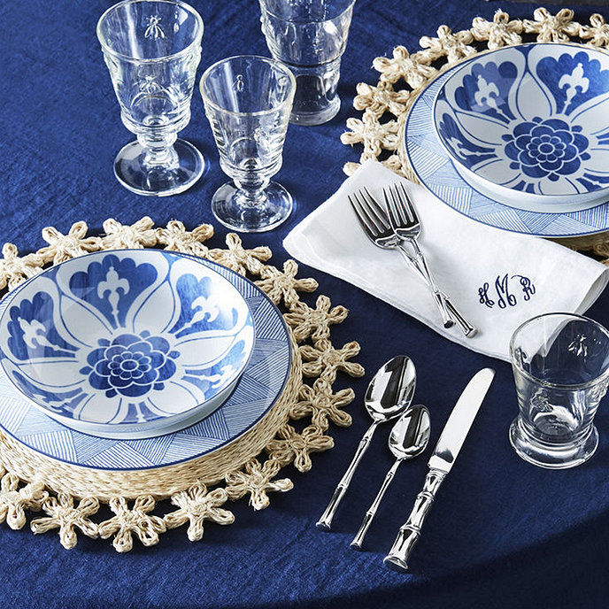
Look how great the table covering looks! It adds the perfect amount of color without taking away from the blue and white. It provides a stunning backdrop for the dishes.
TEN
And last, don't miss the rug. It ties the room together by incorporating all of the colors used, from the shelving all the way to the tablescape.

On another note, I did a little research while getting ready for this post, and as it turns out, the dishes used in this room are available through Ballard Designs. They are from the Campbell House Dinnerware Collection.
 |
| Bunny Williams for Ballard Designs |
Until next time...
Kathryn
Love everything about this kitchen.
ReplyDeleteI know. It's pretty close to perfect!
DeleteGreat post, and great website. Thanks for the information! BYDLENÍ
ReplyDelete